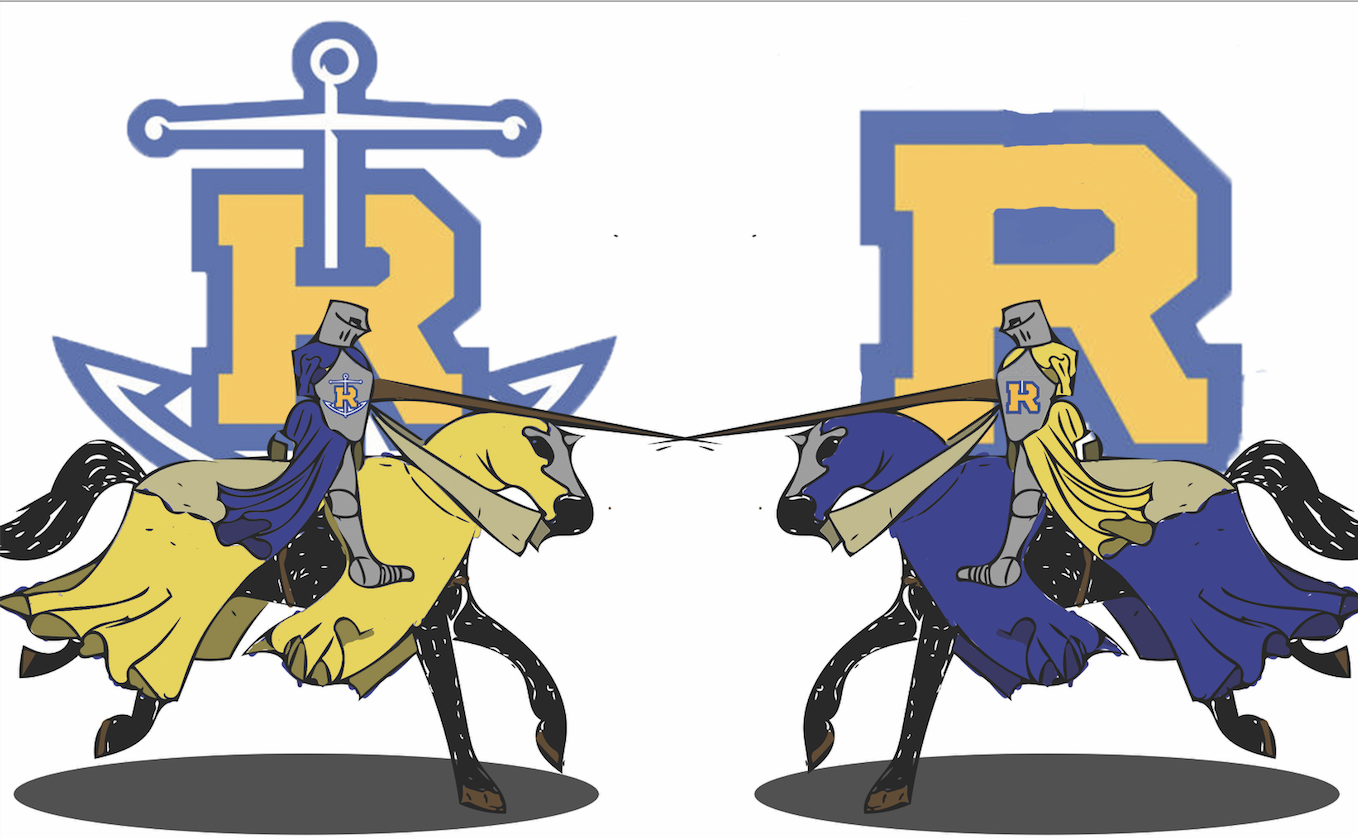
Recently, ideas were proposed to change Rollins’ iconic Anchor-R logo to a plain yellow and blue “R.” While this change may seem minor, it is one that undermines an important aspect of the Rollins community.
The decision was made by the Office of Marketing and Communications, who felt that the logo needed to be streamlined to help emphasize the academic prestige of Rollins. The meaning of the anchor created many questions as to its meaning and, therefore, was said to interfere with Rollins’ branding message.
Although these may be valid benefits of the change, the negative impact on the campus community may well offset and even outweigh these benefits.
As an incoming student, the anchor guided me toward finding my own path, interests, and passions here at Rollins. While our official motto may be “Fiat Lux,” I found much more meaning in a less official but just as important slogan used around the school: “Find Your Anchor.”
The anchor has come to symbolize an important part of my development here at Rollins and embodies much of what I think makes Rollins great.
Many other students, groups, and organizations have found similar meaning in the beloved anchor. Whether by sporting the logo, chanting “Anchor Down,” or even wearing it prominently on sports uniforms, it has come to stand as a symbol for the school.
While the marketing team has emphasized that the anchor will not be entirely removed from the community, removing it from the logo that is meant to encompass the school’s image is absurd.
The anchor represents too much of this community to be removed from the school’s image. The idea that it is distracting and unclear is not even relevant. Do we not want to communicate our strong sense of community and identity to prospective students? Does it matter if it takes a couple questions to understand its meaning? The fact that it has a back story shows the uniqueness of Rollins.
While many great schools sport simple logos like the plain “R” favored by the marketing team, those at the top are far less streamlined than the team’s argument lets on.
Take Stanford University, for example, whose logo features an “S” covered by a tree. It is even more prominent than the anchor that is supposedly such a hindrance to the communication of academic prowess.
I proudly stand behind a logo that shows the strength of the community that I joined, not a bland letter that I could have as my logo had I gone to any other generic state school. I chose Rollins because it differentiated itself and fostered a strong and unique community.
By removing the anchor, however, the Office of Marketing and Communications will be stripping a community of a symbol of its identity for the sake of conformity and simplicity.
We cannot merely sit back and let another campus change occur without our opinions considered. Kiera McMeekan ‘19 started a petition on change.org to fight the removal of the anchor. If you feel strongly about this change, sign the petition or reach out to administration to let your opinion be heard.


Be First to Comment