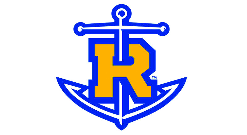
In an effort to create uniformity and consistency across the Rollins brand, the Office of Marketing and Communications proposed to remove the anchor from the athletics logo; however, the majority of students, especially student athletes, are not happy with this idea.
Kiera McMeekan ‘19 created a change.org petition that received over 500 signatures in only one week. The petition is titled “Keep the Rollins logo as is” and asks people to sign in support of the current Anchor-R logo, calling on President Cornwell and the Rollins Marketing team to let students have a say in the matter.

According to Sam Stark, chief marketing and community relations officer, plans to change the logo began approximately five months ago.
The official logo of the college, which is not the Anchor-R, has already been changed and is in the process of being implemented across campus.
The sun symbol above the “Rollins” text was removed to simplify the logo. This is part of a larger plan to rebrand Rollins as a more academically prestigious college.
The Office of Marketing and Communications surveyed prospective and accepted students, and came to the conclusion that while Rollins was known for being a beautiful campus, its academic prestige was not as highly noted; therefore, the marketing team set out to align Rollins’ brand with its academic goals.
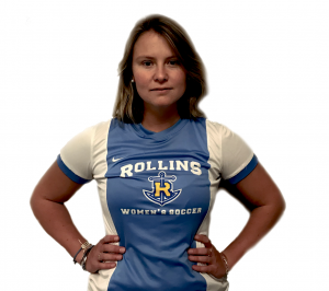
There are a few reasons behind the change, one being to unify and simplify the many logos used throughout Rollins. Many organizations and teams use different logos on campus. While the soccer teams use the Anchor-R on their uniforms, the baseball team uses a gothic-style font.
From a marketing and branding perspective, the logo variation across departments on campus needs to be limited.
Moreover, Stark pointed out that there are two symbols within the athletics’ logo: an anchor and an R. He said this goes against the balance standards used when creating a logo.
“The anchor is bigger than the R and slashes through it,” said Stark. He said that, unless you are an insider, you do not really understand the meaning behind the anchor or a Tar. “There shouldn’t be a two-sided story to branding. It needs balance.”
Since the Athletic Department created it around 10 years ago, the Anchor-R logo has been implemented all across campus; it is built into the floor of the McKean gym, student workout facilities, and book store and athletics merchandise.
When asked about the cost of the implemented changes, Stark did not have a specific number, but said that there will be a transition period of implementing the logo that has not been identified yet. “When it is time for these divisions to do their next order, that’s when it would happen. There is not a forced action to order everything new,” stated Stark.
As the logo is built into the physical environment of the college, it is also ingrained in the identity of many student athletes.
“It differentiates us from everyone else,” said McMeekan, a women’s soccer player, member of the Student Athlete Advisory Committee (SAAC), and creator of the petition. McMeekan said that the women’s soccer team just got their locker room redone, where the Anchor-R logo stands proudly on the wall and reads “Be her anchor” beneath it.
“That is something that we identify with. Why is it being stripped away?” she said.
The Office of Marketing and Communications understands that the anchor is important to students and said that they are not trying to take it away from anyone, just not presenting it as the forefront symbol. “We just need to be more conscious about how we share it externally,” said Stark.
In response to this, Ziad Melhaoui ‘19, member of the men’s tennis team and president of SAAC, said, “So, it has to be a secret anchor to us now? Why can’t we let it represent us?”
Melhaoui and McMeekan found out about the proposed change for the first time at a meeting between athletic administrators and marketing last week. Melhaoui contacted other student athletes in SAAC, telling them about the proposed change and asking them in a poll if they agree with getting rid of the anchor—28 respondents said no. Only two said yes.
McMeekan said that because of the uproar amongst her peers, and how stubborn she felt marketing was being about it, she wanted to be heard. That is when she created the petition. The marketing team has seen the petition and Stark said that he loves that there is passion for it.
Since the planning began five months ago, the marketing team has done many reviews with stakeholders, including students, different departments and faculty members, trustees, and alumni. Reviews have been mixed, but when the full story is shared about why the office wants to change it, people understood. “They understand the marketing and branding rational versus just the passion,” said Stark.

The office did not specify which student organizations were consulted during the planning process, but said that they plan to reach out to student groups like SAAC and SGA within the coming weeks.
Chandler Middlebrook ’18, a member of the Rollins softball team, said that she understood the reasoning behind the changes from the marketing perspective, but is frustrated with how it was communicated to the students. She said that she feels like it was a secret up until now, since the planning has been going on for so long. “If it’s not a secret, why has it been made to be one? We just randomly find out about the logo changing and nothing is being communicated to the students wearing the logo,” she said.
Stark, a Rollins alumnus and former student athlete, said that he understood why students are so passionate about the logo. “I get it,” he said, “I am very invested in Rollins, but there is a higher marketing and branding issue that we have to resolve.”
Stark said that the logo change is not yet official, and the new brand guidelines will be announced in the next six to eight weeks.


Be First to Comment